How to Create a Tab Bar in SwiftUI with TabView - iOS Tutorial
In this iOS tutorial, we are going to learn how to implement a tab bar in SwiftUI by leveraging TabView. Feel free to skip directly to the source code (at the bottom of the page), if you already know what you're doing.
Since SwiftUI has been launched at WWDC 2019, developers have developed their new applications almost exclusively on this extraordinarily exciting framework. These apps had erased any doubts about SwiftUI adoption success.
To help newbies get familiar with this SwiftUI, we are going to make some short articles on SwiftUI, with quick features and code snippets. The first article is how to quickly implement and style a tab bar navigation in SwiftUI using the TabView component.
Note: This SwiftUI tutorial has been written with Xcode 11 – official version. Some APIs from the beta version might be changed (such as TabbedView) or deprecated. Make sure you are on the latest Xcode version before running the code from this SwiftUI tutorial.
Mega Bundle Sale is ON! Get ALL of our React Native codebases at 90% OFF discount 🔥
Get the Mega Bundle1. Create a TabView
Trust us, it's super easy – Adding a tab bar navigation to an iOS app is way more easier in SwiftUI than it used to be in UIKit. Just add this block of code into the ContentView's body:
TabView {
   Text("The content of the first view")
     .tabItem {
        Image(systemName: "phone.fill")
        Text("First Tab")
      }
}
Type TabView and Xcode will present you with a closure like this. This TabView includes two parts:
- Text("The content of the first view"): this is the view that will be displayed when tapping on this tab item. We will discuss this in more details in the next step.
- tabItem : This is the tab item that you can style with an image and text.
Now, let's run to see what's going on:
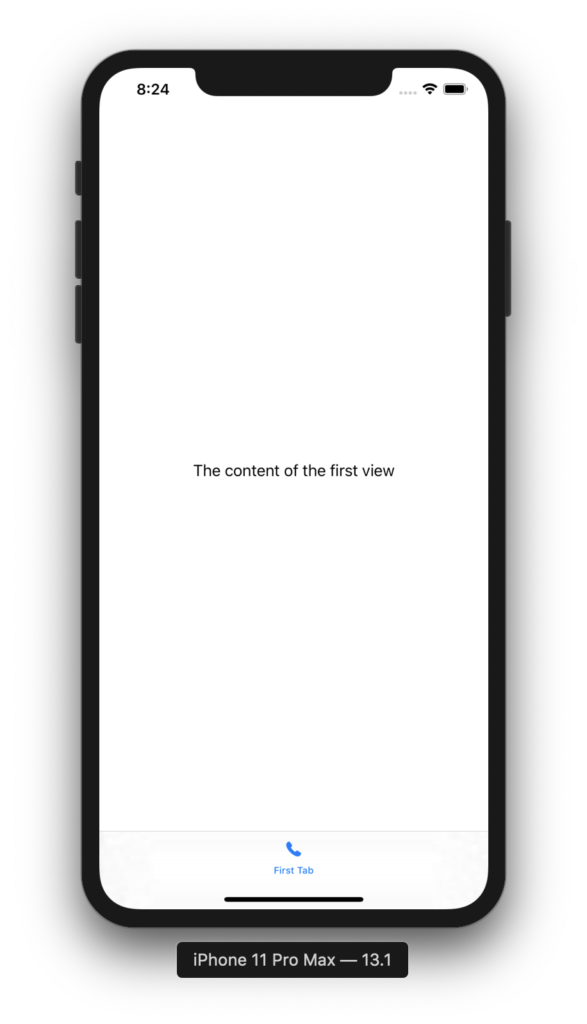
Nice work. But in actual projects, we usually need to have more than 2 items. Continue onto the next step to learn more.
2. Add More Tab Items and Other APIs
Let's add another tab item like this.
TabView {
   Text("The content of the first view")
     .tabItem {
        Image(systemName: "phone.fill")
        Text("First Tab")
      }

   Text("The content of the second view")
     .tabItem {
        Image(systemName: "tv.fill")
        Text("Second Tab")
      }
}
This code will give us the following result:
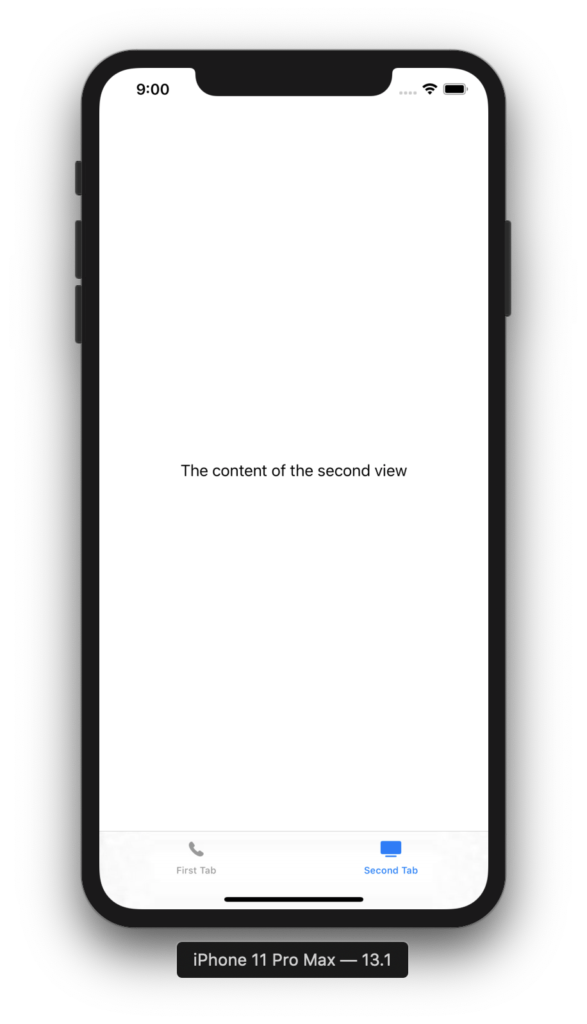
Super simple, right?
Mega Bundle Sale is ON! Get ALL of our React Native codebases at 90% OFF discount 🔥
Get the Mega Bundle3. Practical TabView Scenarios
Now, let's imagine that the content of these two items isn't simply Text, but instead it's a View with a bunch of components embedded in it. So, how can we embed them within our TabView?
Add the following code at the end of ContentView struct, after the closing curly brace:
struct RedView: View {
    var body: some View {
        Color.red
    }
}

struct BlueView: View {
    var body: some View {
        Color.blue
    }
}
Here, define two views: the struct's name itself says it all. One is red, one is blue.
Next, replace the entire contents of ContentView's body with the following:
TabView {
   RedView()
   BlueView()
}
Basically, when a view is put inside the TabView, it will be considered as a child view of that TabView. Let's run to see how it looks like because this looks super simple, right?
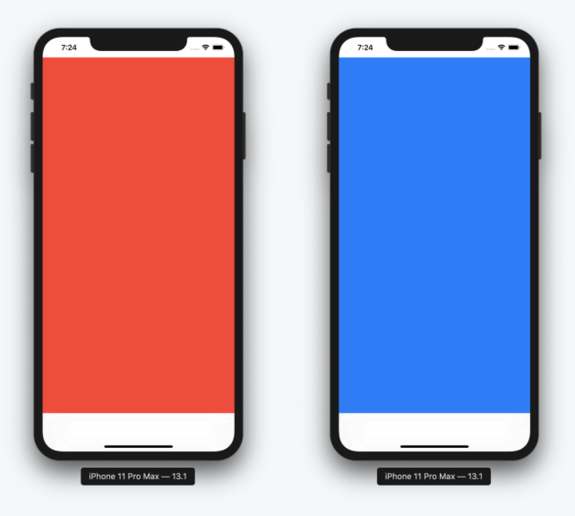
Build & run the app. Tap the place where allegedly there is a tab item. You'll notice the screen's background color changes.
Now, that we know how to embed a view within a TabView in SwiftUI, let's style the tab item as we did in the first step.
TabView {
   RedView()
     .tabItem {
        Image(systemName: "phone.fill")
        Text("First Tab")
    }
   BlueView()
     .tabItem {
        Image(systemName: "tv.fill")
        Text("Second Tab")
   }
}
Build and run to check out our sweet TabView SwiftUI app. To keep this tutorial simple, we didn't create complex views. But keep in mind you can literally add views of any complexity. Even view controllers (though you'll have to bridge them to SwiftUI views, but that's a different tutorial).
Looking for a custom mobile application?
Our team of expert mobile developers can help you build a custom mobile app that meets your specific needs.
Get in TouchConclusion
As you can see, adding a tab bar in a SwiftUI iOS app is extremely simple, thanks to TabView. This is the first one in our free collection of tutorials about SwiftUI. So stay tuned and join our waitlist to get the latest tutorials when they're ready.
Here's the final source code, which can also be found on Github
struct RedView: View {
    var body: some View {
        Color.red
    }
}

struct BlueView: View {
    var body: some View {
        Color.blue
    }
}

TabView {
   RedView()
     .tabItem {
        Image(systemName: "phone.fill")
        Text("First Tab")
    }
   BlueView()
     .tabItem {
        Image(systemName: "tv.fill")
        Text("Second Tab")
   }
}
Also, we'd love to know your thoughts on SwiftUI. Feel free send us messages if you have any concerns or questions. You can download the full source code on GitHub. If you'd like this tutorial, don't forget to also give us a star on Github!