Accelerators - Modern UX Design Patterns in Mobile Apps

In the past couple of years, a wave of new modern UX design patterns has emerged within the mobile design ecosystem. Many of these patterns became incredibly popular, given their success on highly scalable apps. In this series of articles, we’ll emphasize a few of these UX patterns, and discuss the benefits of applying them to your app design processes. This initial post will focus on accelerators.
Accelerators – Modern UX Design Patterns
Accelerators are basically hidden shortcuts, that allow users to perform a specific action in an efficient way. They are usually targeted towards the heaviest users of an app. These users need ways to engage with your app quickly and more easily, so accelerators are a good way to achieve that. Accelerators are derived from existing features of your app. They will always have a complementing feature, that is targeted towards users that are not very familiar with all the features and shortcuts. Their role is to increase familiarity, usability and engagement. Improving on all these fronts will increase the long-term retention of your customers.
Popular accelerators used across a large variety of apps
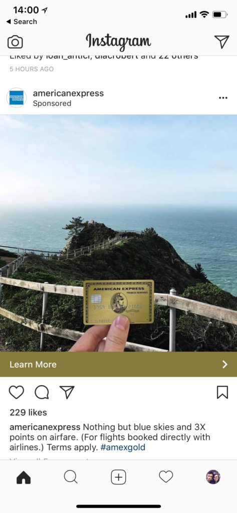
One of the most popular accelerators in the world is probably Instagram’s Like accelerator. This is used by hundreds of millions of users daily. Let take a look at Instagram’s news feed screen. Users can “Like” a post published by their friends, by tapping on the heart icon button, that’s displayed below the photos. This action also has an accelerator, which is hidden from users unfamiliar with the app, but it’s a huge convenience for extremely engaged users: double tapping on a photo also performs a “Like” action.
Tapping the status bar, scrolls you to the top of the screen automatically. The same thing can be achieved by double tapping the tab button of the current tab screen (for apps with a tab bar navigation)
Long pressing on the “+” button, on Instagram, will open up the Photo Library directly. This is a hidden shortcut, that will save users a couple of extra clicks when they’re looking to post a creative from their local library.
Mega Bundle Sale is ON! Get ALL of our React Native codebases at 90% OFF discount 🔥
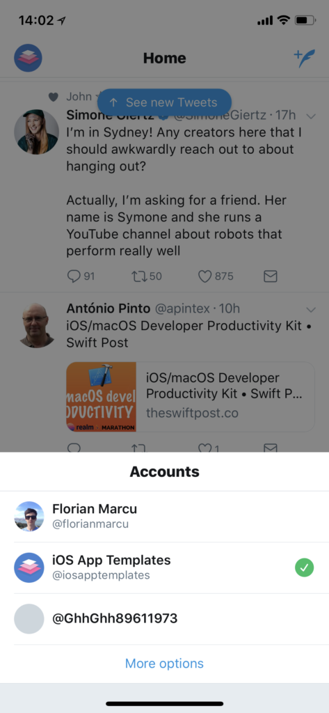
Get the Mega BundleFor apps that have multiple account switchers, long pressing on the “Profile” tab would usually display the list of logged in accounts, so that you can quickly switch between accounts (see Twitter or Instagram)
Swipe on the main screen – This accelerator is used by apps to switch between tabs or screens. Take a look at Facebook and Instagram, where swiping right will open up the Camera. Snapchat’s right swipe action will take you to the Friends List screen. Not many users know about these shortcuts initially, but once they discover them, they retain better on the platform. Using popular modern UX design patterns is a powerful method for increasing long-term retention.
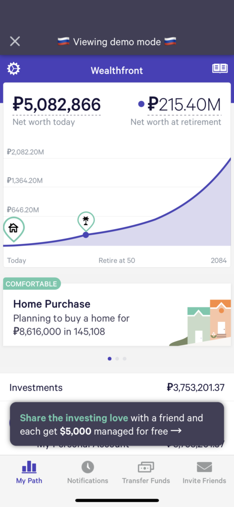
Device shaking action can toggle the state of your app into “Secret” mode. This is a common feature in finance apps, when you want to hide the real amounts of dollars, in order to be able to share the screen with your friends (see Wealthfront’s iOS app for an example). Shaking can also be used to allow users to file bugs (also known as “rage shake”).
Swipe right on a cell “destroys” the item from the list. Take a look at Gmail or Outlook apps. When you swipe right on an email, it gets archived and dissappears from the list. Doing the opposite swipe will reveal more option on the email (such as Archive, Mark as Unread, etc).
Tips for designing effective accelerators
-
Make sure you have an obvious, classic way of achieving the actions incorporated by accelerators. New users won’t know them!
-
Educate your userbase. Show them tooltips or tutorials with the accelerators. Help users discover the accelerators.
-
Stick to the trending patterns. Do not confuse your users by changing the trends. If tapping on the status bar, scrolls to the top in almost all the apps, do not change this behavior for your app. This will create a lot of confusion among users.
Looking for a custom mobile application?
Our team of expert mobile developers can help you build a custom mobile app that meets your specific needs.
Get in TouchStay tuned for a long series of modern UX design patterns that can be applied in mobile apps. We are using many of these patterns in our own iOS templates, such as our latest News Reader App Template.
Let us know if there’s any other accelerators you’re using for your app. Would love to hear more!